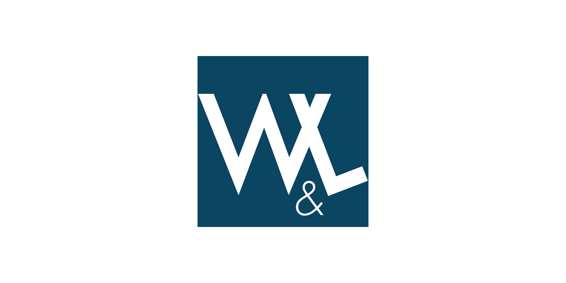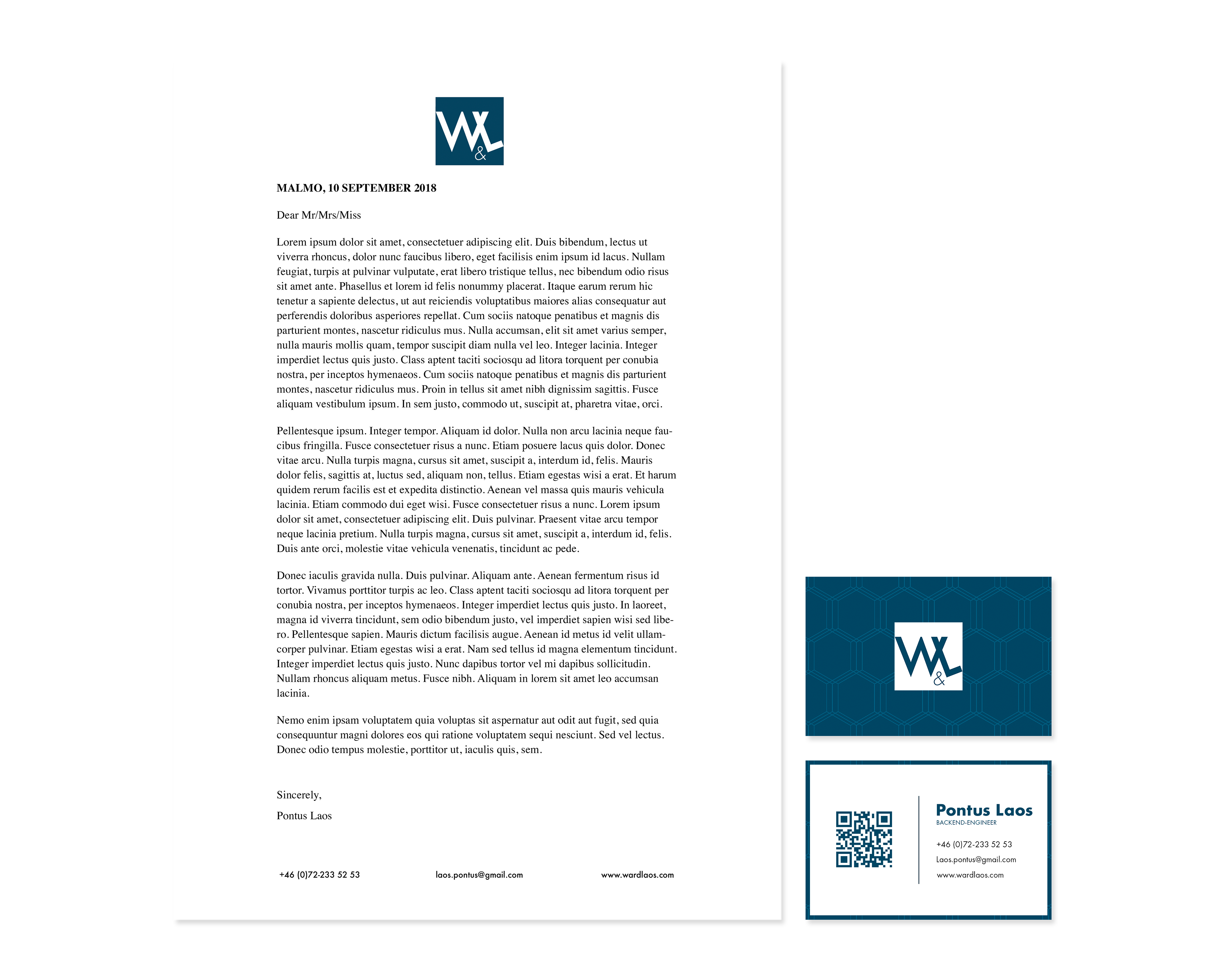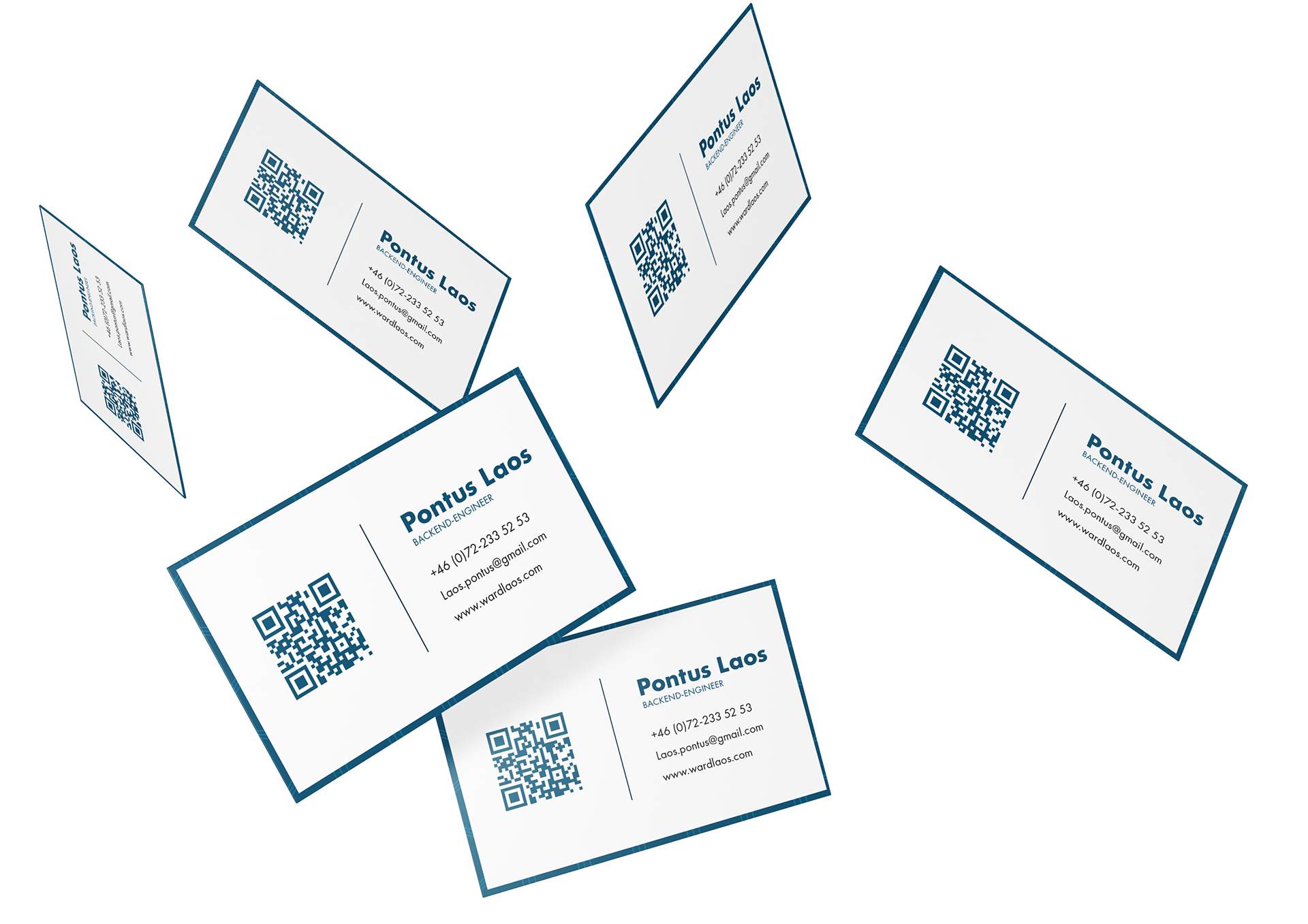
This project was one of my first assignments in my graphic design program at Malmo University. We worked a lot about typography our first semester and they wanted us to use our new knowledge about typography in this assignment. I worked with a company my cousin had called "Ward & Laos".
They were a tech-company who designed websites. I wanted a more IT/webb/tech feeling to their brand. The "W" and the "L" are designed to look like a "X" , as a way of showing the collaboration between them. It is very common to use an "X" between two persons or companies when they do collaborations, or at least it is very trendy.